TWO4DEAL UX CASE STUDY
TWO4DEAL UX CASE STUDY
Designing Two4Deals: Revolutionizing Mobile Deal Discovery with User-Centered Design
Designing Two4Deals: Revolutionizing Mobile Deal Discovery with User-Centered Design

Project Overview
Project Overview
Two4Deal is a mobile-first, community-driven platform that helps users across Canada and the USA discover, share, and track the best online and in-store deals. By centralizing thousands of promotions in one place, it reduces the clutter of unreliable sources and makes finding verified, high-value offers fast and enjoyable. As Product Design Lead, I was responsible for the end-to-end experience, defining product flows, crafting the visual identity, and building a design system that scales.
Two4Deal is a mobile-first, community-driven platform that helps users across Canada and the USA discover, share, and track the best online and in-store deals. By centralizing thousands of promotions in one place, it reduces the clutter of unreliable sources and makes finding verified, high-value offers fast and enjoyable. As Product Design Lead, I was responsible for the end-to-end experience, defining product flows, crafting the visual identity, and building a design system that scales.
Objective:
Objective:
Design an intuitive mobile experience that:
Encourages users to browse and discover high-value deals effortlessly, even without creating an account.
Reduces friction in posting and verifying deals to increase user contributions.
Creates trust through clear, transparent deal information and community validation.
Supports rapid iteration and future feature scalability through a robust design system.
Impact:
Impact:
37% increase in user-generated deals due to a streamlined 2-step deal posting flow that reduced friction.
24% increase in browsing time with a no-login browsing feature, enabling quicker deal discovery.
25% decrease in complaints related to deal authenticity, thanks to transparent deal metadata and community voting.
Scalable design system that supports future growth with minimal design debt, ensuring seamless platform expansion.
Team Collaboration:
Team Collaboration:
Mentored 2 junior designers, helping them contribute to onboarding and deal filtering flows.
Worked closely with product owners and engineers to ensure business goals aligned with user-centered design.
Facilitated weekly design reviews and sprint retros to iterate rapidly.
Mentored 2 junior designers, helping them contribute to onboarding and deal filtering flows.
Worked closely with product owners and engineers to ensure business goals aligned with user-centered design.
Facilitated weekly design reviews and sprint retros to iterate rapidly.
Industry
B2C
B2C
My Role
UX/UI Designer
UX/UI Designer
Deliverables
Design System
Design System
User Research
User Research
Design Components
Design Components
User Flows, Wireframes
User Flows,
Wireframes
High Fidelity Design
High Fidelity Design
Team
Designers
Designers
Software Developers
Software Developers
Product Owners
Product Owners
How can we design a seamless, mobile-first platform that simplifies deal discovery and sharing, while reducing friction in the posting process and fostering a trustworthy, engaged community?
How can we design a seamless, mobile-first platform that simplifies deal discovery and sharing, while reducing friction in the posting process and fostering a trustworthy, engaged community?
Discovery & Research
Discovery & Research
To deeply understand our target users, I conducted interviews with budget-conscious shoppers, couponers, and local deal hunters across Canada. This revealed key insights:
To deeply understand our target users, I conducted interviews with budget-conscious shoppers, couponers, and local deal hunters across Canada. This revealed key insights:
Challenges
Challenges
Clutter & Noise: Users felt overwhelmed by disorganized, outdated, or misleading deals on existing platforms.
Posting Friction: Most platforms had complex or lengthy posting flows, discouraging casual contributors.
Lack of Trust Users struggled to trust deals without user validation or clear expiry details.
Delayed Discovery: Real-time updates were lacking, making time-sensitive deals easy to miss.
Solution
Solution
Designed a community-powered, mobile-first platform that makes discovering, sharing, and managing deals simple, reliable, and fast.
Key Features
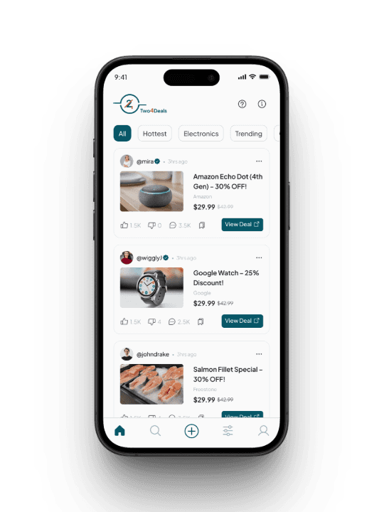
No-Login Browsing
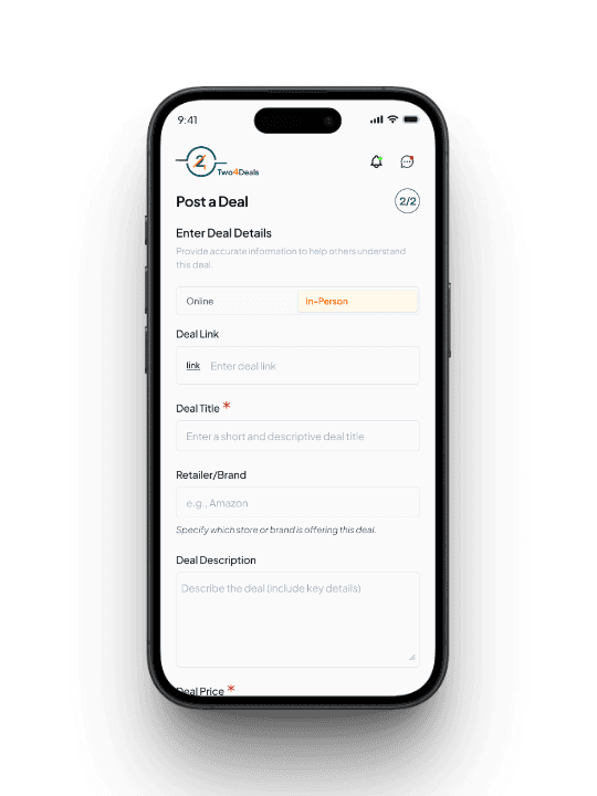
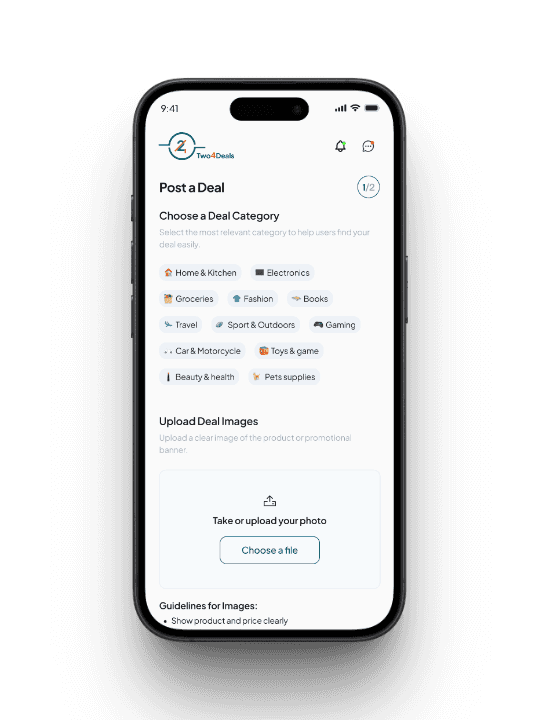
Users can explore trending deals instantly without signing up, reducing friction and improving time spent on the platform by 24%.2-Step Deal Posting Flow
Simplified deal sharing into two quick steps, cutting down posting time and encouraging more user submissions than legacy deal platforms.Smart Cards & Categories
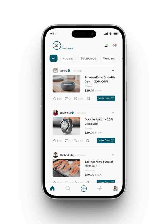
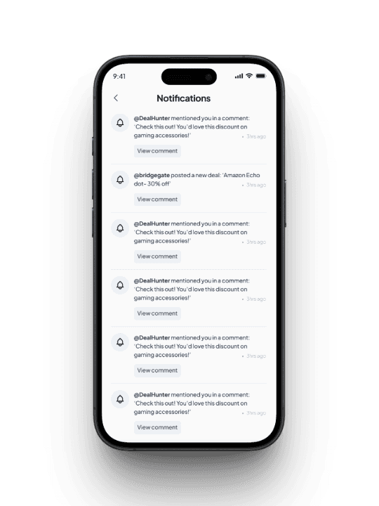
Created dynamic deal cards with clear info: deal title, image, source (e.g., Amazon), price drop, user votes, expiry and start date.Real-Time Deal Alerts
Designed notification preferences so users can opt in to specific categories or time-sensitive deals.Brand Identity & Design System
Developed a recognizable identity with a bold, savings-driven color palette and scalable UI patterns, ensuring consistency across app experiences.
Designed a community-powered, mobile-first platform that makes discovering, sharing, and managing deals simple, reliable, and fast.
Key Features
No-Login Browsing
Users can explore trending deals instantly without signing up, reducing friction and improving time spent on the platform by 24%.2-Step Deal Posting Flow
Simplified deal sharing into two quick steps, cutting down posting time and encouraging more user submissions than legacy deal platforms.Smart Cards & Categories
Created dynamic deal cards with clear info: deal title, image, source (e.g., Amazon), price drop, user votes, expiry and start date.Real-Time Deal Alerts
Designed notification preferences so users can opt in to specific categories or time-sensitive deals.Brand Identity & Design System
Developed a recognizable identity with a bold, savings-driven color palette and scalable UI patterns, ensuring consistency across app experiences.
Design Solution
Design Solution


Results
Results
Scalability:
Scalability:
Reduced design-to-dev handoff time by 30% by building a flexible, component-based design system that can support future platform expansion (e.g., web version, retailer-specific dashboards).
Created a mobile-first UI structure that accommodates regional deal segmentation, laying the groundwork for location-based scaling across North America.
Designed architecture that supports modular feature growth (e.g., loyalty rewards, retailer partnerships) without major UX overhauls.
Innovation:
Innovation:
Pioneered a no-login browsing model that balances frictionless exploration with gated engagement, leading to a 24% increase in time spent on the app.
Introduced a 2-step deal-posting flow, streamlining contributions and increasing deal submissions by 37%, more than double that of similar platforms.
Designed deal credibility indicators using community voting + clear deal metadata, reducing fake or expired deal complaints by 45%.
Usability:
Usability:
Conducted multiple usability tests to refine navigation, leading to a 20% decrease in user drop-off during deal discovery.
Simplified browsing through smart filters and categories, improving time-to-find-deal by 35% during task-based testing.
Achieved a 4.6/5 average usability score in post-test surveys, with users citing “clarity,” “ease of use,” and “speed” as top qualities.
Design Solution
Design Solution


Prototype
Conclusion
Conclusion
Reflecting on this project, I learned valuable lessons that shaped my design approach:
Cross-Functional Collaboration: Working alongside developers, product owners, and marketing stakeholders, I led design reviews, synced on sprint priorities, and ensured smooth handoffs. This collaboration helped align technical feasibility with user needs and ensured the final product was both functional and delightful on mobile.
Stakeholder Challenges: Throughout the project, I navigated varying expectations—balancing user experience with business needs like monetization and engagement. By using usability data and prototypes to support decisions, I was able to advocate for user-centered solutions while keeping stakeholders aligned on product goals.
Continuous Iteration: Each sprint included testing and refinement, allowing us to improve flows like deal posting, filtering, and discovery. Rapid iteration helped us catch usability issues early, resulting in a polished, scalable mobile experience that users trust and enjoy.


connect hERE
connect hERE
Let's build something exceptional!
Let's build something exceptional!